小皮Linux面板
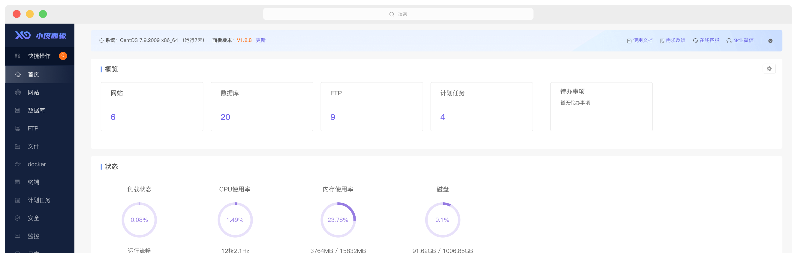
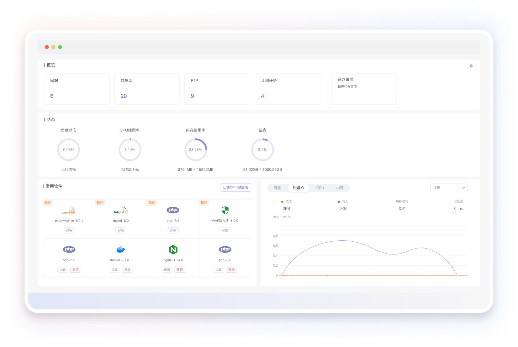
 极速网站部署
一键搭建PHP、Java、Python、Node等网站环境, 集成众多开源Web应用,SSL证书自动签发部署,建
站更简单、更快捷。
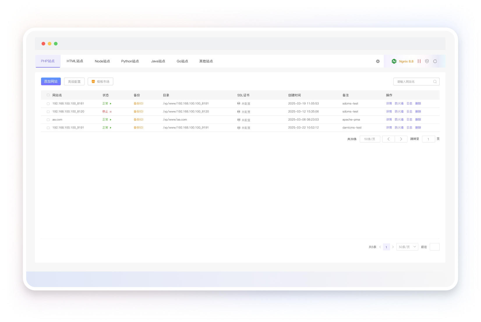
 极速网站部署

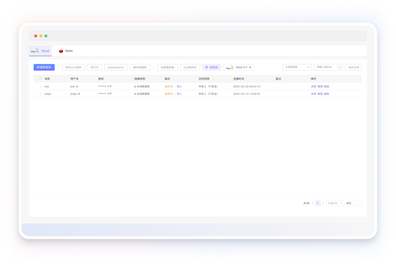
 低门槛数据库自治

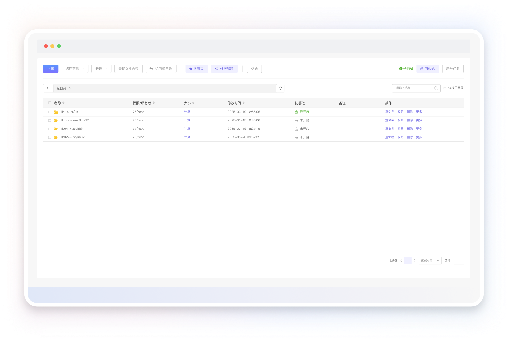
 友好的文件系统管理

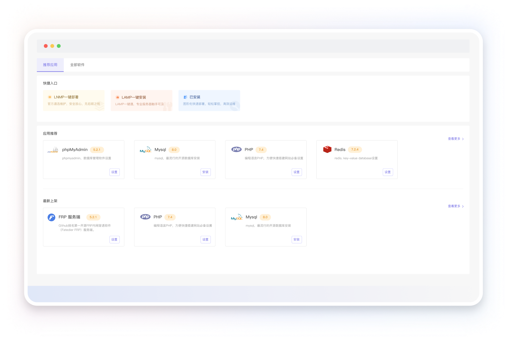
 种类丰富的应用商店

 好用且永久免费
极速网站部署
低门槛数据库自治
友好的文件系统管理
种类丰富的应用商店
好用且永久免费